The Role of Colour Psychology in Newcastle Web Design
One of the most powerful tools in a web designer’s arsenal is colour. The strategic use of colour can evoke specific emotions, enhance usability, and convey brand identity. In Newcastle, a vibrant city with a rich cultural heritage, understanding the role of colour psychology is essential for creating visually appealing and effective web designs. In this article, we will explore the significance of colour psychology in Newcastle web design and how it can influence user perception and engagement.
The Influence of Colour Psychology:
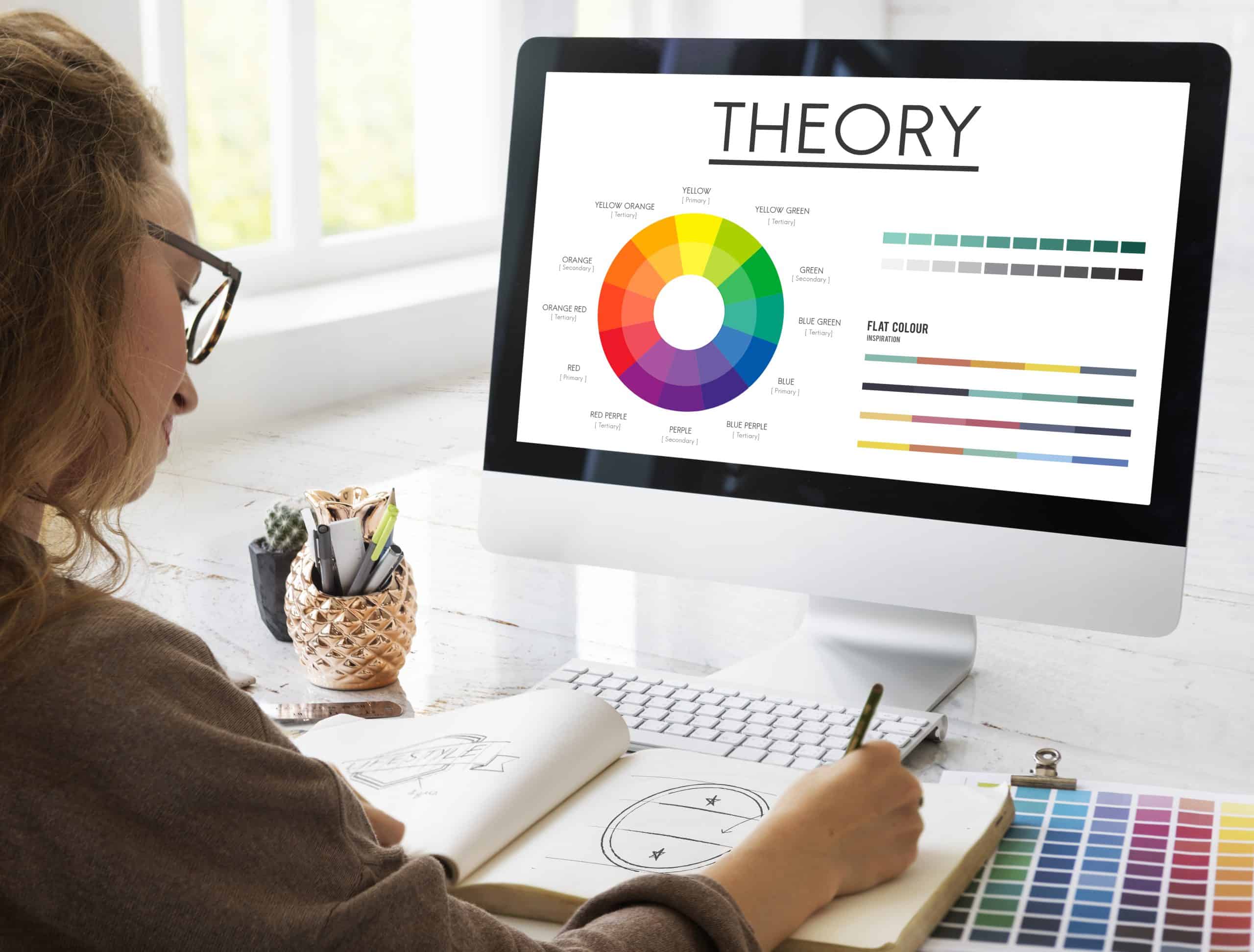
Colour psychology refers to the study of how colours affect human behavior, emotions, and perceptions. Different colours can evoke distinct emotions and trigger specific responses. By strategically selecting and implementing colours in web design, designers can elicit desired reactions from users and effectively communicate a brand’s message. Let’s take a closer look at some commonly used colours and their psychological impact:
- Blue: Blue is often associated with calmness, trust, and reliability. It is frequently used by businesses that aim to convey a sense of professionalism and dependability. In Newcastle web design, shades of blue may be used to represent the city’s maritime history, instilling a feeling of stability and trust in the user. In Newcastle’s web design, shades of blue, reminiscent of the vast North Sea and the city’s maritime history, not only instill a feeling of stability and trust in the user but also create a sense of serenity that reflects the region’s tranquil coastal charm.
- Green: Green is commonly associated with nature, growth, and freshness. It can create a sense of harmony and relaxation. For Newcastle web design, green tones can be employed to reflect the city’s lush surroundings and promote a sustainable and eco-friendly image. By incorporating shades of green in Newcastle web design, web designers can not only capture the essence of the city’s lush surroundings but also reinforce its commitment to sustainability, creating a website that resonates with environmentally conscious users.
- Orange: Orange is a vibrant and energetic colour that signifies enthusiasm and creativity. It can be used to grab users’ attention and evoke a sense of excitement. In Newcastle, where the vibrant cultural scene thrives, web designers may employ orange hues to reflect the city’s lively atmosphere. By incorporating vibrant orange hues into web design in Newcastle, web designers can capture the energetic spirit of the city’s cultural scene, immersing users in an exciting and engaging online experience that mirrors the lively atmosphere of Newcastle’s artistic and creative community.
- Grey: Grey is often associated with neutrality, balance, and sophistication. It can be used to create a sleek and modern look in web design. In Newcastle, where historical architecture meets contemporary design, the strategic use of grey can reflect the city’s unique blend of tradition and innovation.
The Impact on User Experience:
The effective use of colour psychology in Newcastle web design can greatly enhance the user experience. By selecting colours that align with the desired emotional response, web designers can establish a positive connection with users, fostering a sense of trust, engagement, and brand loyalty. For instance, warm colours like red and yellow can stimulate appetite and encourage action, making them suitable for websites in the hospitality or food industry. In Newcastle web design, strategically incorporating warm colours such as red and yellow can not only stimulate users’ appetite and encourage them to act but also create a visually enticing experience that effectively captures the essence of the city’s vibrant culinary scene, fostering a strong connection between users and hospitality or food-related businesses.
Furthermore, colour can also be utilized to improve website usability. By using contrasting colours for text and background, designers can ensure optimal readability and accessibility for all users. Proper colour contrast is especially important for web design in Newcastle, where diverse audiences with different visual capabilities may engage with the website.
Maintaining Brand Consistency:
In addition to evoking emotions and enhancing usability, colour psychology plays a crucial role in maintaining brand consistency. Consistent use of colours across various platforms, including websites, social media, and marketing materials, helps establish a strong brand identity. By using colours that align with the brand’s values and target audience preferences, web designers in Newcastle can create a cohesive visual experience that resonates with users and reinforces brand recognition.
Furthermore, by employing a consistent colour palette that aligns with the brand’s values and targets audience preferences, web designers in Newcastle can create a seamless and recognizable visual experience across multiple platforms, ensuring brand recognition and reinforcing the brand’s identity in the minds of users.
Conclusion:
In the ever-evolving world of web design, understanding the role of colour psychology is vital for creating visually appealing and engaging websites. In Newcastle, a city with a vibrant cultural scene and rich history, colour choices can play a significant role in capturing the essence of the city and communicating brand messages effectively. By harnessing the power of colour psychology, web designers can create memorable user experiences, foster emotional connections, and establish a strong brand presence in the digital realm.
Moreover, in Newcastle’s dynamic web design landscape, the strategic implementation of colour psychology allows web designers to go beyond aesthetics and tap into the city’s rich history and cultural significance. By carefully selecting colours that reflect Newcastle’s heritage, such as incorporating shades inspired by its iconic architecture or cultural symbols, web designers can create a sense of authenticity and connection with the local community. This attention to detail in colour choices enables web designs to transcend visual appeal and become immersive experiences that resonate with users on a deeper level. By utilizing the power of colour psychology, Newcastle web designers can transform websites into powerful storytelling platforms, effectively communicating brand messages and leaving a lasting impression on visitors.
Bottrell Media is a leading web design agency in Newcastle! With their exceptional understanding of colour psychology and innovative approach to web design, Bottrell is revolutionizing the digital landscape in the city. Their expert team creates visually stunning websites that not only captivate users but also effectively communicate brand messages. From strategically selecting colours that evoke desired emotions to maintaining brand consistency, Bottrell’s web design expertise is second to none. If you’re looking to enhance your online presence and create a memorable user experience, look no further than Bottrell. Trust them to bring your vision to life and establish a strong brand presence in the digital realm.
Contact us at @ Bottrell Media
45 Hunter St, Newcastle, NSW 2300.
P: 02 40275782
E: office@bottrellmedia.com.au
Helpful Articles
Web Design Newcastle Bottrell Media
Mobile-First Website Design for Newcastle Customers
Socials & Links for Bottrell Media
Facebook – Bottrell Media Facebook Page
Instagram – Bottrell Media Instagram Page
Google – Bottrell Media Google


