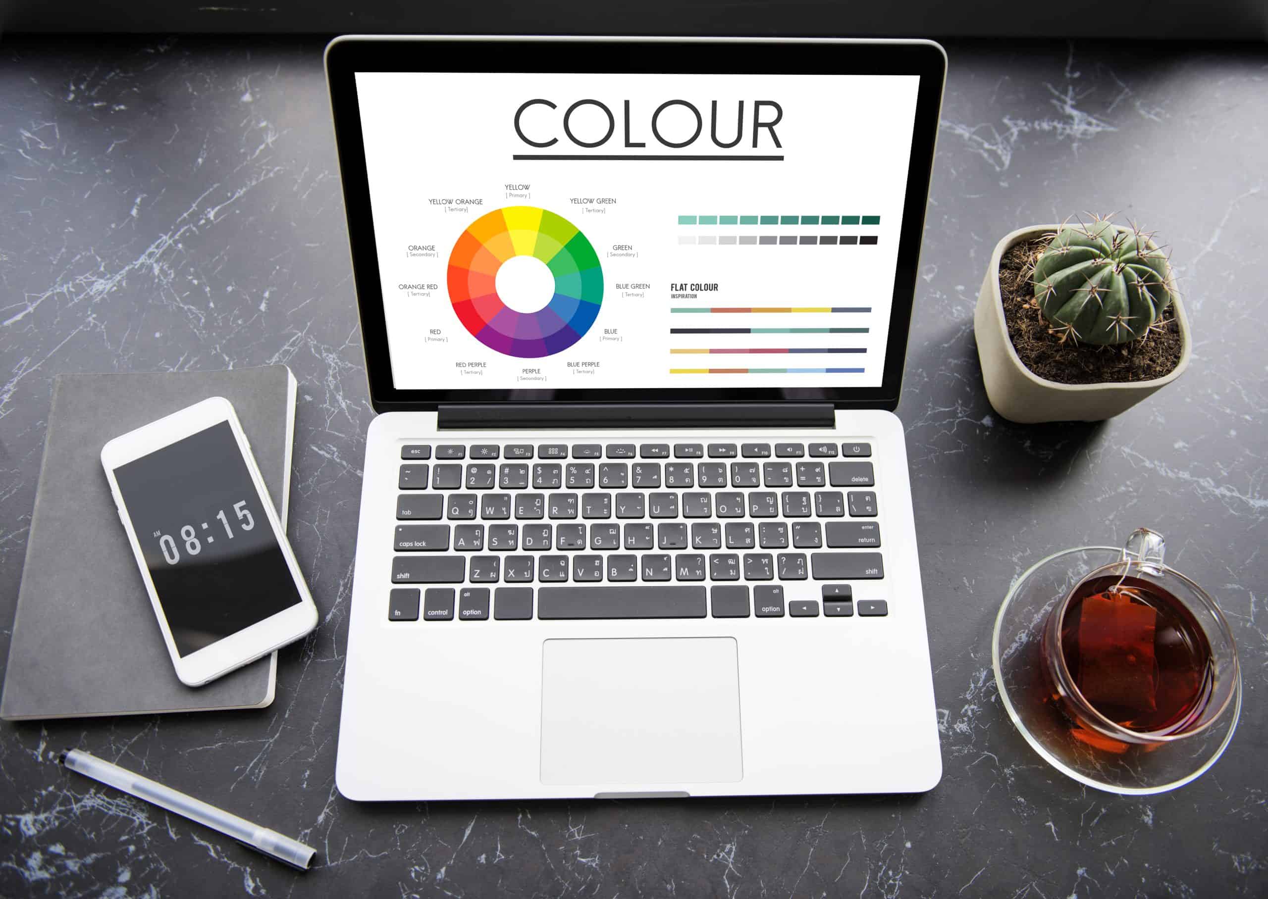
Maitland Web Design: Choosing the Right Color Palette
Introduction
In the world of web design, color plays a vital role in creating an engaging and visually appealing website. When it comes to Maitland web design, selecting the right color palette is crucial for effectively representing your brand, creating a positive user experience, and capturing the attention of your target audience. This article explores the importance of choosing the right color palette for your Maitland website and provides valuable insights to help you make informed decisions.
Reflecting on Your Brand Identity
The color palette of your website should align with your brand identity and convey the desired message to your audience. Consider your brand’s personality, values, and target market when selecting colors. For example, warm and earthy tones can create a sense of comfort and reliability, while vibrant and bold colors can evoke energy and excitement. Consistency in color usage throughout your website helps reinforce your brand identity and fosters recognition.
Creating Visual Hierarchy
The strategic use of color can help create a visual hierarchy on your website, guiding users’ attention and highlighting important elements. By employing contrasting colors for headlines, buttons, or call-to-action (CTA) elements, you can make them stand out and draw users’ focus. Subtle variations of the same color can be used to differentiate sections or provide a sense of flow. Carefully considering the hierarchy of colors enhances the user experience and improves navigation.
Considering Cultural Significance
When designing a website for Maitland, it is essential to consider the cultural significance of colors. Different cultures may associate colors with specific meanings or symbolism. Take into account the local Maitland community and its cultural values when choosing your color palette. Researching and understanding cultural color associations can prevent any unintentional misinterpretations and ensure your website resonates positively with the target audience.
Enhancing Readability and Accessibility
While selecting visually appealing colors is important, it is equally crucial to ensure readability and accessibility for all users. Consider the contrast between text and background colors to ensure text legibility, particularly for users with visual impairments. Adhering to accessibility guidelines, such as WCAG (Web Content Accessibility Guidelines), ensures that your website is inclusive and can be accessed by a wider audience.
Using Color Psychology
Color psychology explores the impact of different colors on human emotions and behaviors. By incorporating color psychology principles, you can evoke specific feelings and associations in your website visitors. For example, blue is often associated with trust and tranquility, while green represents growth and nature. Understanding the psychological impact of colors can help you create a website that resonates with your audience and elicits the desired response.
Testing and Iterating
Once you have chosen a color palette for your Maitland website, it is crucial to test it across different devices and screen sizes. Colors may appear differently on various screens, so ensure your chosen palette maintains its integrity and readability across platforms. Additionally, gather feedback from users and analyze website analytics to identify any areas for improvement. Continuously iterating and refining your color palette based on user feedback ensures an optimal user experience.
Conclusion
Selecting the right color palette is a critical aspect of Maitland web design. By choosing colors that reflect your brand identity, creating a visual hierarchy, considering cultural significance, enhancing readability and accessibility, and leveraging color psychology, you can create a visually appealing and engaging website that resonates with your audience. Remember to test your chosen colors and gather feedback to make necessary refinements. A thoughtfully selected color palette will not only enhance the aesthetics of your Maitland website but also contribute to a positive user experience and effective brand communication.
Q: Why is choosing the right color palette important for my website?
A: The right color palette is crucial for your website as it reflects your brand identity, creates visual hierarchy, enhances user experience, and captures the attention of your target audience. It sets the tone and helps convey your desired message effectively.
Q: How do I choose a color palette that reflects my brand identity?
A: To choose a color palette that reflects your brand identity, consider your brand’s personality, values, and target market. Think about the emotions and associations you want to evoke. Research color meanings and symbolism to ensure your color choices align with your brand’s identity and resonate with your audience.
Q: What is the visual hierarchy, and how does color play a role in it?
A: Visual hierarchy refers to the arrangement and prioritization of elements on a web page. Colors can be used strategically to create a visual hierarchy by contrasting important elements, using bold colors for headlines or call-to-action buttons, and employing subtle variations of the same color to differentiate sections. This helps guide users’ attention and improves navigation.
Q: Should I consider cultural significance when choosing a color palette?
A: Yes, considering cultural significance is important when selecting a color palette. Different cultures may associate colors with specific meanings or symbolism. Research the local culture and community to ensure your chosen colors align with their values and avoid any unintentional misinterpretations.
Q: How can I ensure readability and accessibility with my color choices?
A: Ensuring readability and accessibility is crucial for a user-friendly website. Consider the contrast between text and background colors to ensure legibility, especially for users with visual impairments. Adhere to accessibility guidelines, such as WCAG, to make your website inclusive and accessible to a wider audience.
Q: Can color psychology influence user behavior on my website?
A: Yes, color psychology can influence user behavior on your website. Different colors evoke specific emotions and associations. For example, warm colors can create a sense of excitement, while cool colors can convey calmness. Understanding color psychology can help you create a website that resonates with your audience and elicits the desired response.
Q: How do I test my chosen color palette for different devices and screens?
A: Testing your chosen color palette is important to ensure consistency across different devices and screens. View your website on various devices and screen sizes to see how the colors appear. Make sure the colors maintain their integrity and readability. Adjustments may be needed to ensure a consistent experience for all users.
Q: Should I gather feedback on my color palette from users?
A: Yes, gathering feedback from users is valuable in assessing the effectiveness of your color palette. Ask for input on the overall aesthetics, readability, and emotions evoked. User feedback can provide insights for any necessary refinements to improve the user experience.
Q: Is it okay to iterate and refine my color palette over time?
A: Yes, it is encouraged to iterate and refine your color palette over time. As your brand evolves and user preferences change, you may need to make adjustments. Continuously monitoring website analytics and user feedback allows you to identify areas for improvement and make necessary refinements for an optimal user experience.
Q: Can I seek professional help in choosing the right color palette for my website?
A: Absolutely! If you’re unsure about choosing the right color palette for your website, it can be beneficial to consult with a professional web designer or a branding expert. They can provide guidance, and expertise, and help you create a cohesive color palette that aligns with your brand and resonates with your target audience.
Contact us at @ Bottrell Media
93 Lawes St, East Maitland NSW 2323
P: 02 40275782
E: office@bottrellmedia.com.au
Socials & Links for Bottrell Media
Facebook – Bottrell Media Facebook Page
Instagram – Bottrell Media Instagram Page
Google – Bottrell Media Google
Helpful articles
Professional Services (Links)


